- April 03, 2017
- Taiho Pharmaceutical Co., Ltd.
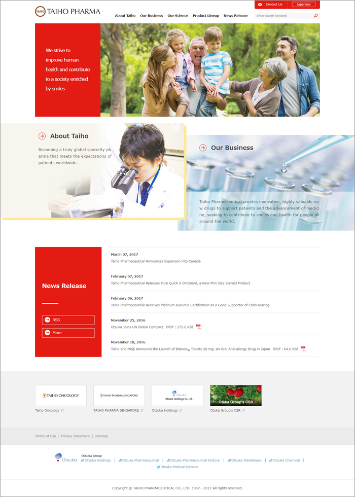
Taiho Pharmaceutical Completely Redesigns Official Website
Taiho Pharmaceutical Co., Ltd. announced today that it has completely redesigned its official website.
Overview of New Design
Design consistency achieved with unified use of corporate colors
The new design employs the Taiho Group’s corporate colors: Taiho Red, Taiho Sepia, and Taiho Yellow. By refreshing the design to create a sense of unity, the company sought to strengthen its corporate branding. Taiho Red the key color, conveys energy, vitality, and dynamism.
Greater usability delivered by responsive web design
The company made the site easier to read and navigate by using responsive web design, which automatically adjusts the layout to fit the screen size of various devices, such as smartphones and tablets.
Site security ensured by always-on SSL
By enabling always-on SSL,* which provides stronger security, the company has improved the site’s reliability, to offer a site that can be used with greater peace of mind.
* “Always-on SSL” is a security method that applies HTTPS (SSL/TLS encryption) to all pages of a website. Encryption prevents contents from things such as falsification.
Visit the official website here: https://www.taiho.co.jp/en/
Taiho Pharmaceutical will continue to strive to make the information it provides at its website more accessible and easy to understand.
Information in this news release was current as of the original release date.
Taiho Pharmaceutical's news releases are intended to provide information to the media. It may contain information about ethical drugs or products under development, however information contained in the news releases are not intended to constitute promotion, advertisement, or medical advice.


